Vancouver Film School
Award – Best Interactive Design
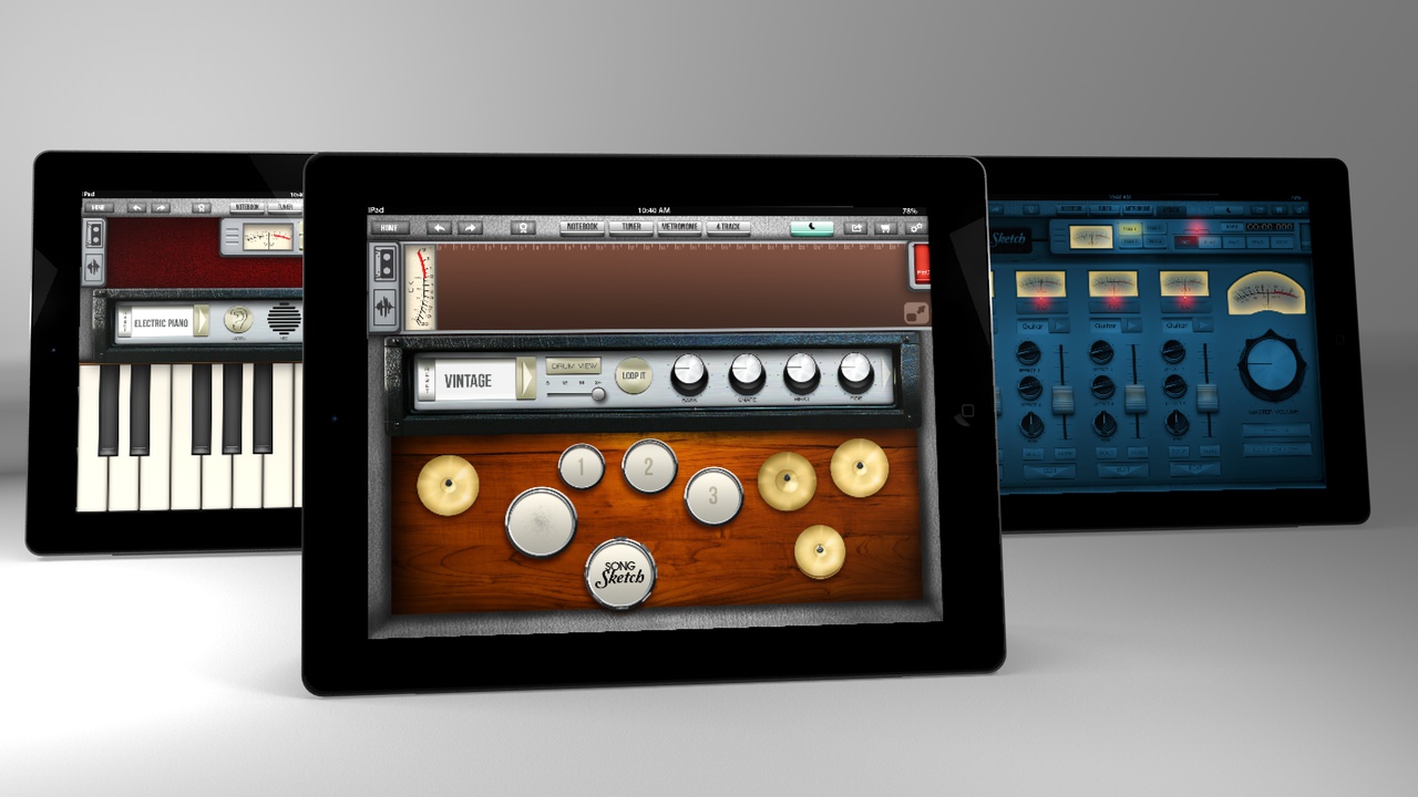
Song Sketch is an app designed to improve the songwriting process. This eight-week project was challenging yet rewarding, helping me discover my passion for designing engaging user interfaces.
Vancouver Film School
Award – Best Interactive Design
Introduction
Music is a subject into which people invest time and money. It’s a big market, especially considering that in the United States alone, there are 900,000 formal members of committees or music institutions. This figure doesn’t even account for the countless young people in schools, high schools, colleges, and universities who are involved in music, whether professionally or as a hobby.
02. Challenge
This project presented numerous challenges along the way. Time was a crucial factor, as I had to wear many hats to cover all areas of this ambitious idea.
I worked as a researcher, project manager, UX designer, UI designer, and also created the brand and all assets for final delivery. In short, there were too many tasks to tackle and very little time to execute them. The main challenge was designing an app that truly offered the most important tools for song creation.
03. Research
The research process was extensive. I investigated apps on the market that offered the capabilities of a portable studio, along with others focused on the actual writing process for songwriters. Additionally, I researched the target audience to understand what they were looking for or using to create their songs.
I conducted a competitive analysis of the market and matched it with the findings on the target audience’s needs. The research and card sorting activities helped me identify the most important functions to make this the best songwriting experience.


04. Design
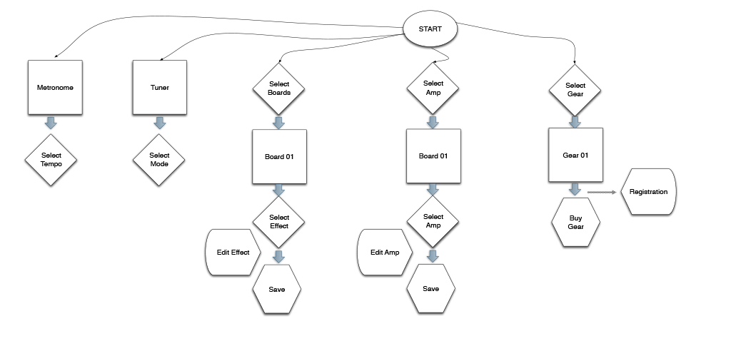
The research allowed me to compile personas, customer journeys, and flows to identify opportunities for the design. I created user flows for the different tasks that songwriters had to go through to create a song.
Additionally, I created mood boards to define the visual aesthetics that were aligned with the target audience. For this, I considered color, typography, textures, and shapes from manuals and music brands from the 60s to the 70s, to shape the personality and tone for the app’s brand.
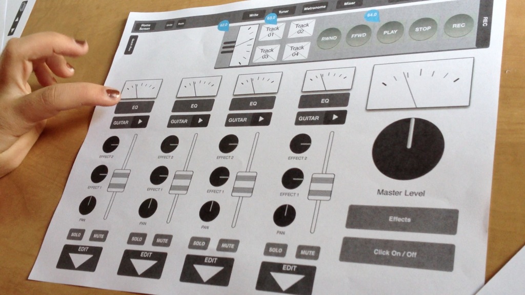
05. User Interface
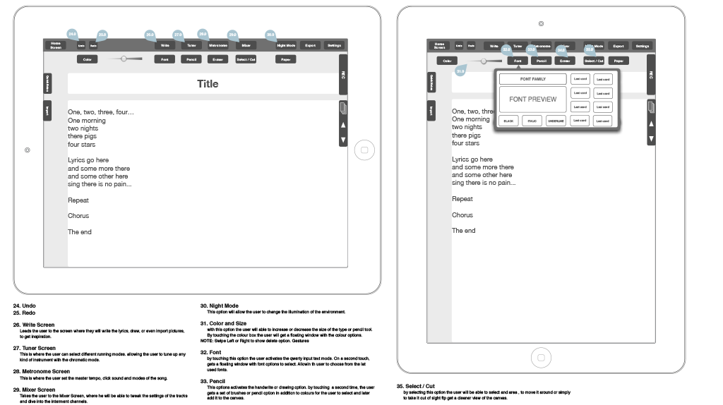
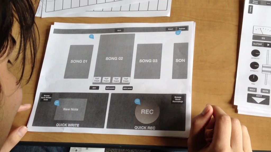
I created a set of wireframes with OmniGraffle to showcase the main functions of the app, which I later used to conduct paper user tests. In these tests, I timed the testers’ performance across a variety of screens.
I had a mix of 50% beginner musicians and 50% non-musical experience participants in the test, to ensure the experience was clear for both groups. After gathering my findings from this test, I addressed the issues identified and then moved forward to design mockups.
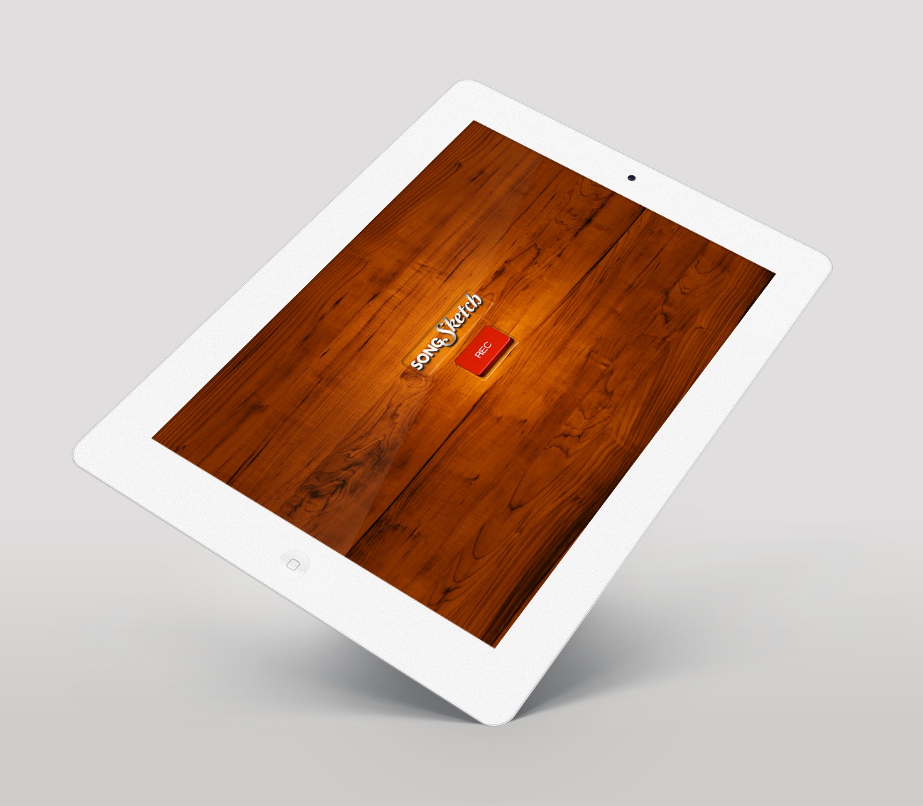
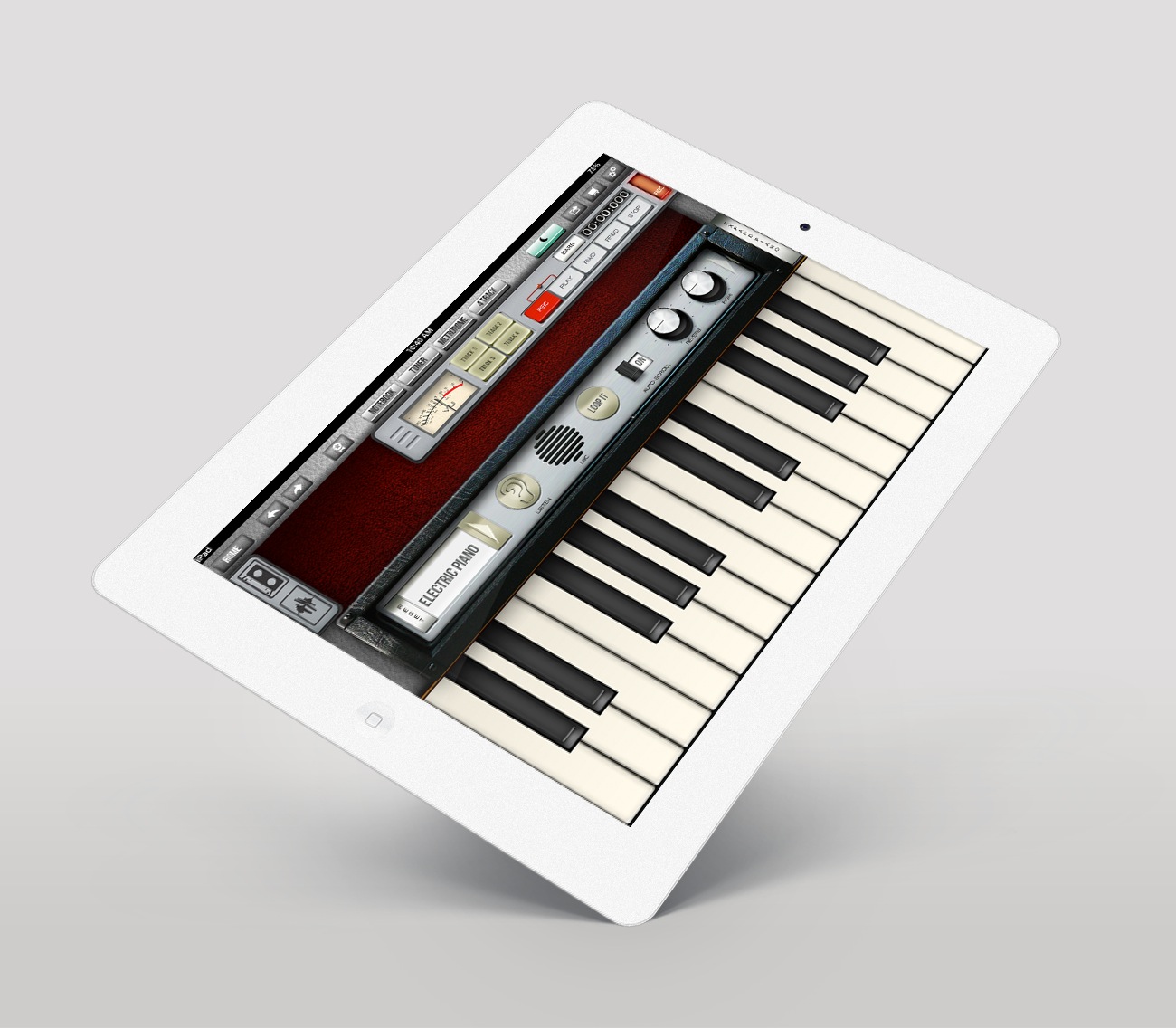
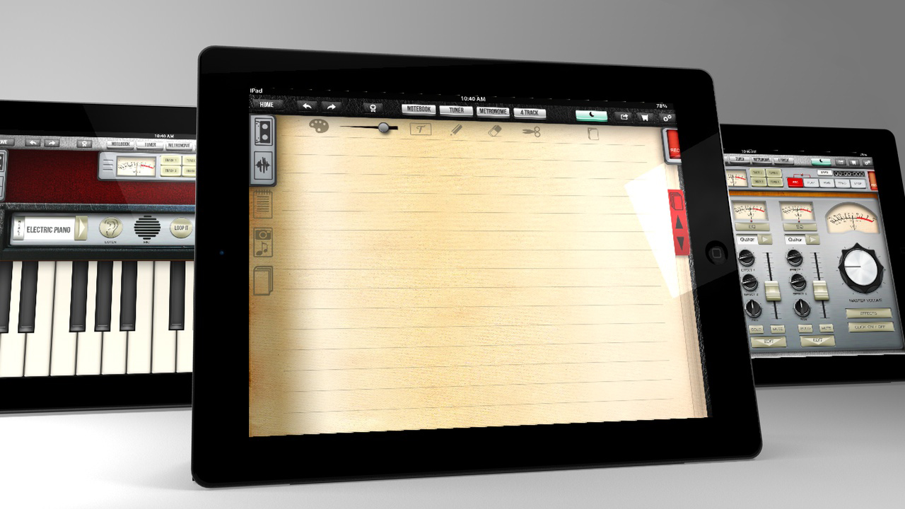
I used Adobe Photoshop and Illustrator to create the user interface. I scanned textures, used photography, and created digital illustrations to generate the different sections of the app.
06. Project Participation
My roles included Research, Project Management, Creative Direction, Information Architecture, Branding, UI Design, UX Design, Illustration, Animation, and Sound Design.
07. Deliverables
- Created wireframes for each screen, showcasing a sitemap, user flows with the main functionalities, and project breakdown structure.
- Created a Branding Document, detailing part of the research, goals and objectives, competitors, creative brief, messaging strategy, brand pyramid, naming, mood boards, logo, app icon, colors, typography, and iconography.
- Produced a User Experience Document, featuring personas, mental model, system map lens, thinking hats, User Test Analysis, The game in the experience, Interface, and main features of the app.
- Delivered an interactive prototype that displayed the main screens of the app
- Created a motion design piece to promote the app, showcasing the power of this design idea.
- This project won the Best Interactive Design at Vancouver Film School.
Best Interactive Design – Vancouver Film School
Song Sketch
Vancouver, Canada – 2012


