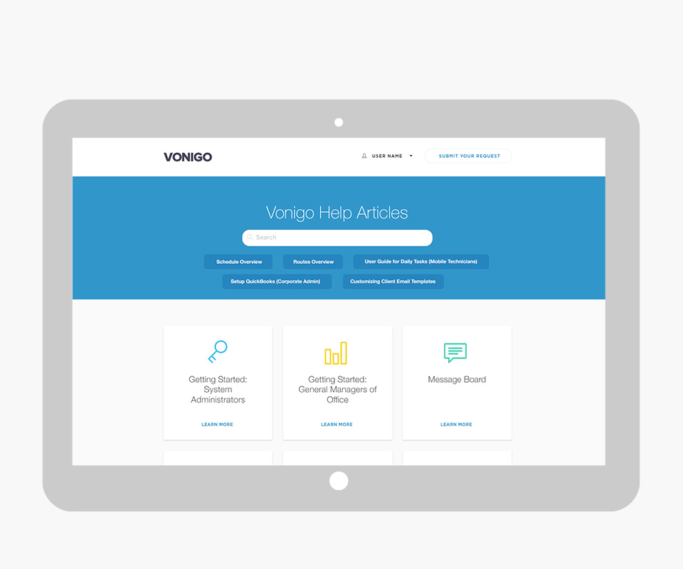
I’ve employed design thinking methodologies to produce documentation and tangible contributions, which have defined a variety of products. For IP reasons, I am not able to show you documentation for a single project at every step. Therefore, I’ll present examples from various projects, using the UX checklist from Github as a basis.
Design is

“User experience design (UXD, UED or XD) is the process of enhancing user satisfaction by improving the usability, accessibility, and pleasure provided in the interaction between the user and the product. User experience design encompasses traditional human–computer interaction (HCI) design, and extends it by addressing all aspects of a product or service as perceived by users.” Wikipedia>
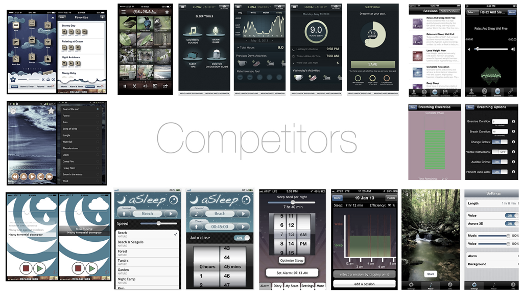
01. Competitive Analysis
Research the market: the good, the bad, the ugly, and the prom queen. Understand your competition.
This analysis is a strategic research of your rivals in a specific field. This tactic is essential to find out what your competitors are doing. You can start by identifying your top ten competitors, analyze their content, analyze their SEO structure, look at their social media presence and integrations to later find areas of improvement for your project.
02. Data Analysis
The answers are in the data. Focus on following the most important data related to the project to gain insights that could define the success or failure of a project. We always need to keep an eye on it, understand how the audience is engaging with your product, campaigns, landing pages; what is working and what is not.
03. User Feedback Design
Conduct surveys, interviews, recordings, screen captures, etc., to find areas of improvement. You might have heard the phrase, “The client is always right.” Well, in this case, it’s the same. They have the answers.
04. User Stories
Create persona designs to drive your choices around design elements. Name, gender, hobbies, daily tasks, frustrations, aspirations—all of these are opportunities for design. Remember, “User-centered design.”
05. User Flows
Define how your persona will access the product and how they are going to use it. Understand your users to define these paths and check for any dead ends.
06. Red Routes
Prioritize features aligned with the goals of your project.
Prioritize features aligned with the goals of your project. It’s important to define these routes in your project to identify, prioritize, and eliminate any obstacles on your user journeys. These red routes will allow you to visualize when things are getting close to going off track, and potentially have a plan of attack to get back on track. Prioritization of features aligned with the goals of your project.
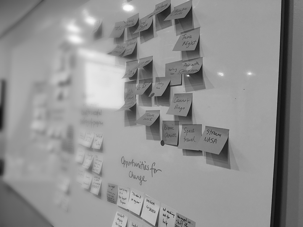
07. Brainstorm & Sketch
Get a bunch of people in a room with paper, markers, and drinks; sketch, make jokes, vote, disrupt, enjoy. When your brain is relaxed, answers come to you easier (sometimes). Have an agenda, allow the group to express their minds, collect the answers, and start looking for patterns.
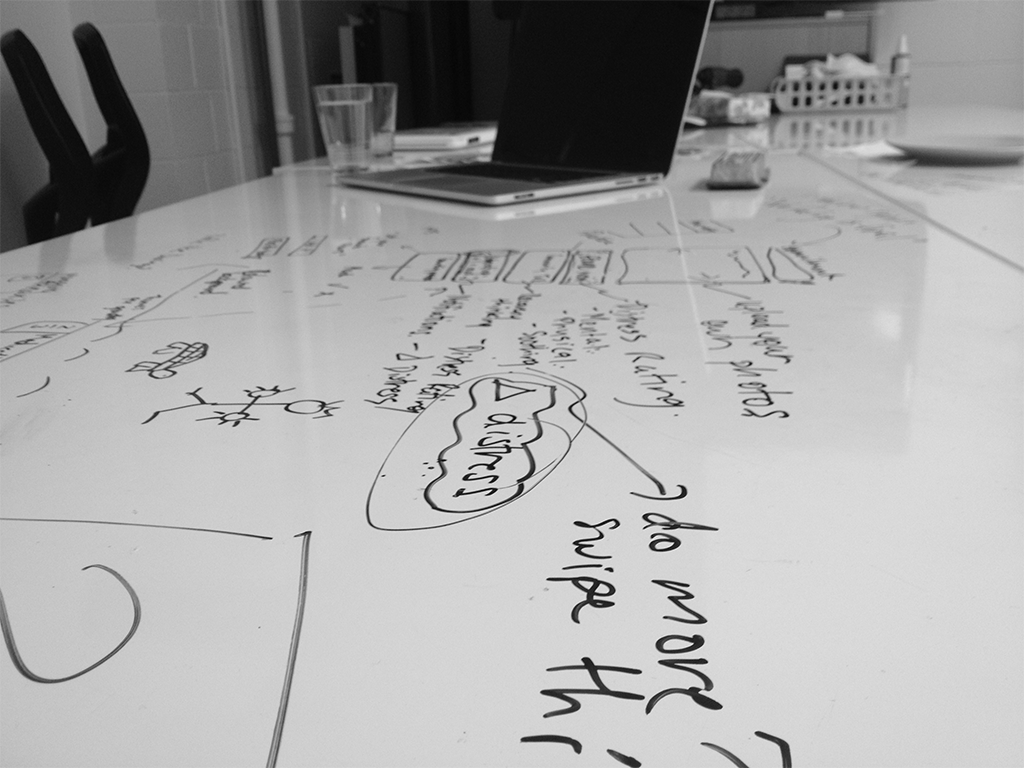
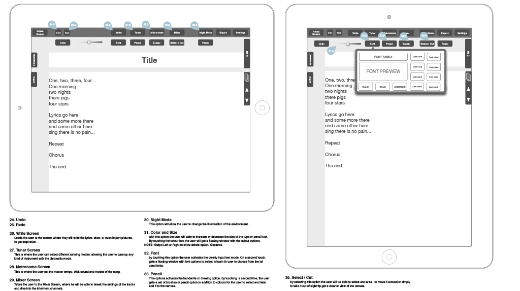
08. Wireframe
These are the blueprints of your experience. They will contain every room, power outlet, door, window, air vent, emergency exit, among all other elements the project includes. Establish patterns, use best practices. It’s good to go into detail on functionality and prototype to ensure we are not missing components; what can we improve?
09. Prototype
Use paper, or any of the digital tools available. Navigate your app before it’s alive. How do you go back? Does it make sense? Prototyping should never stop but should be more intense in pre-production.
10. Information Architecture
Organize the information in a way that your users and search engines can understand. Organized information will allow users to locate other pages and features. This information should be aligned with your strategy.
11. Language
Design the language of your brand. What is this person like? How does this person talk to the audience?
The tone and personality of your brand must resonate with your target. Your product has to look and speak like your target; there must be a connection in values, ideals, stereotypes, to meet the target audience’s expectations.
12. Accessibility
Create designs using WCAG regulations to ensure the experience is accessible to users with vision and other limitations.

13. UI Elements
Guidelines with Patterns.
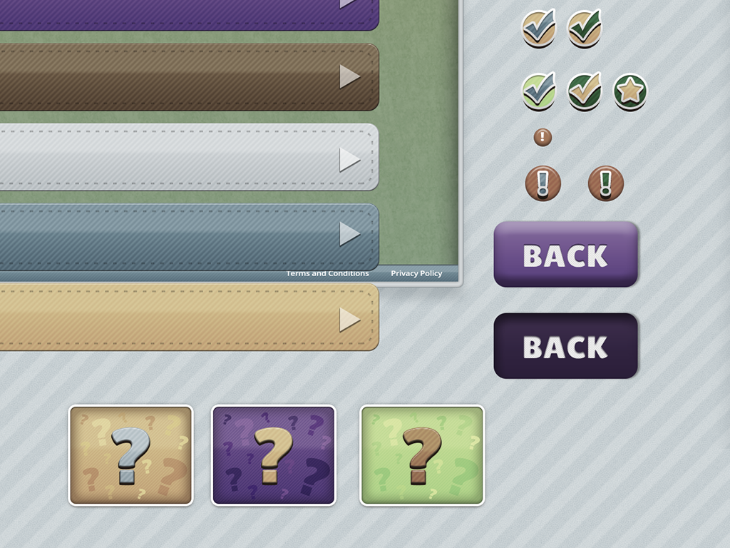
Create a playground of interactive components that will allow users to interact with the digital experience: sliders, buttons, tabs, radio buttons, dropdowns, text links, body copy. Create guidelines with patterns to be followed in the app. The style guide is a living document that normally evolves with your project; keep it updated.
14. Gestures
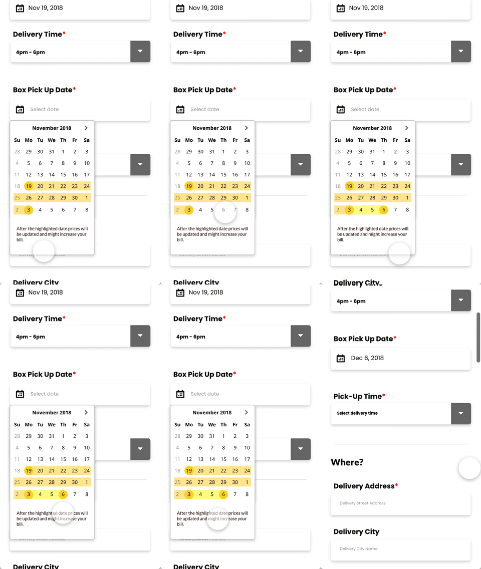
Add gestures to your experiences to make them more fun to use. Indicate all of these in your wireframes.

15. Responsiveness
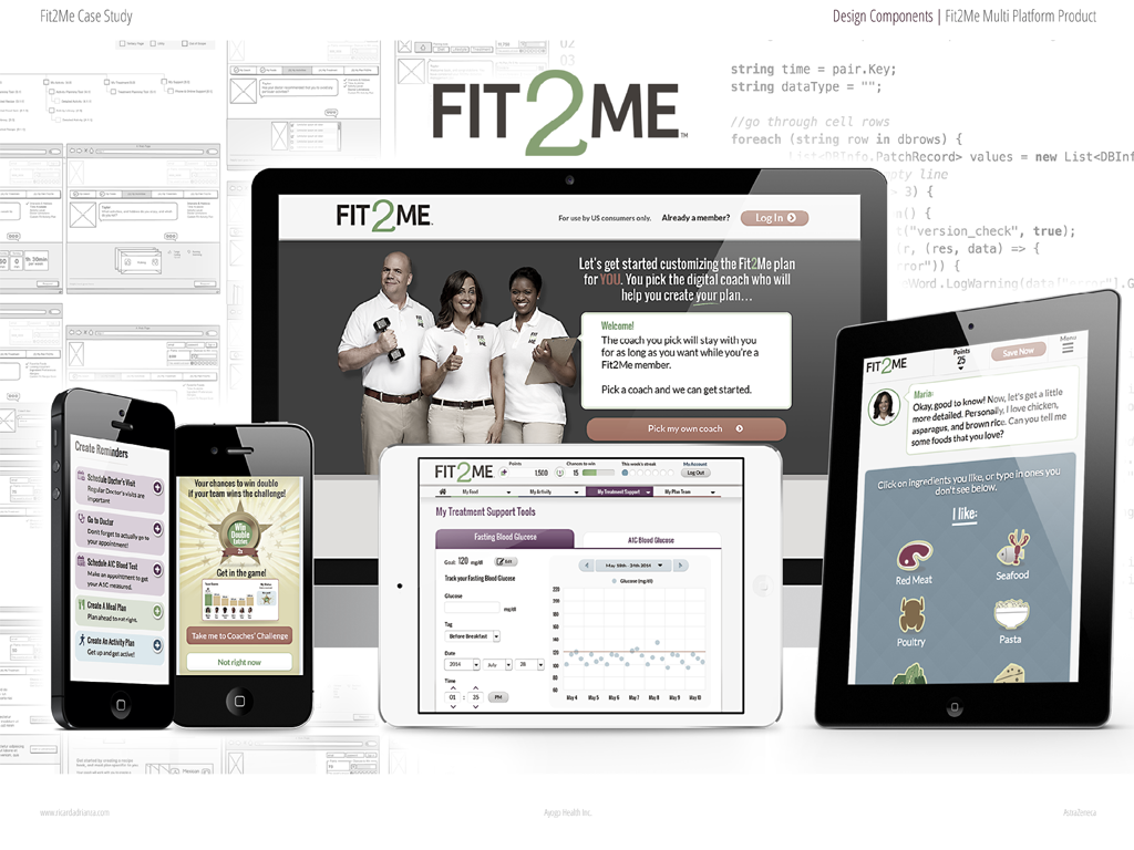
This will depend on the screens the client requires to offer in the project, but it is highly recommended that every digital experience be available on every screen size.
16. If You Have To Wait
Take advantage of every waiting moment, like slow connections, heavy graphics, or just a super complex futuristic app loading time. Use graphics to delight the user in their wait.
17. Errors and Empty States
Always remember to design error messages and include them as part of your UI playground. Consider them in the finalized comps. In addition, design empty states to make your app more appealing in the initial experience; even though there is no information, it still has to look nice.
18. Completed Actions
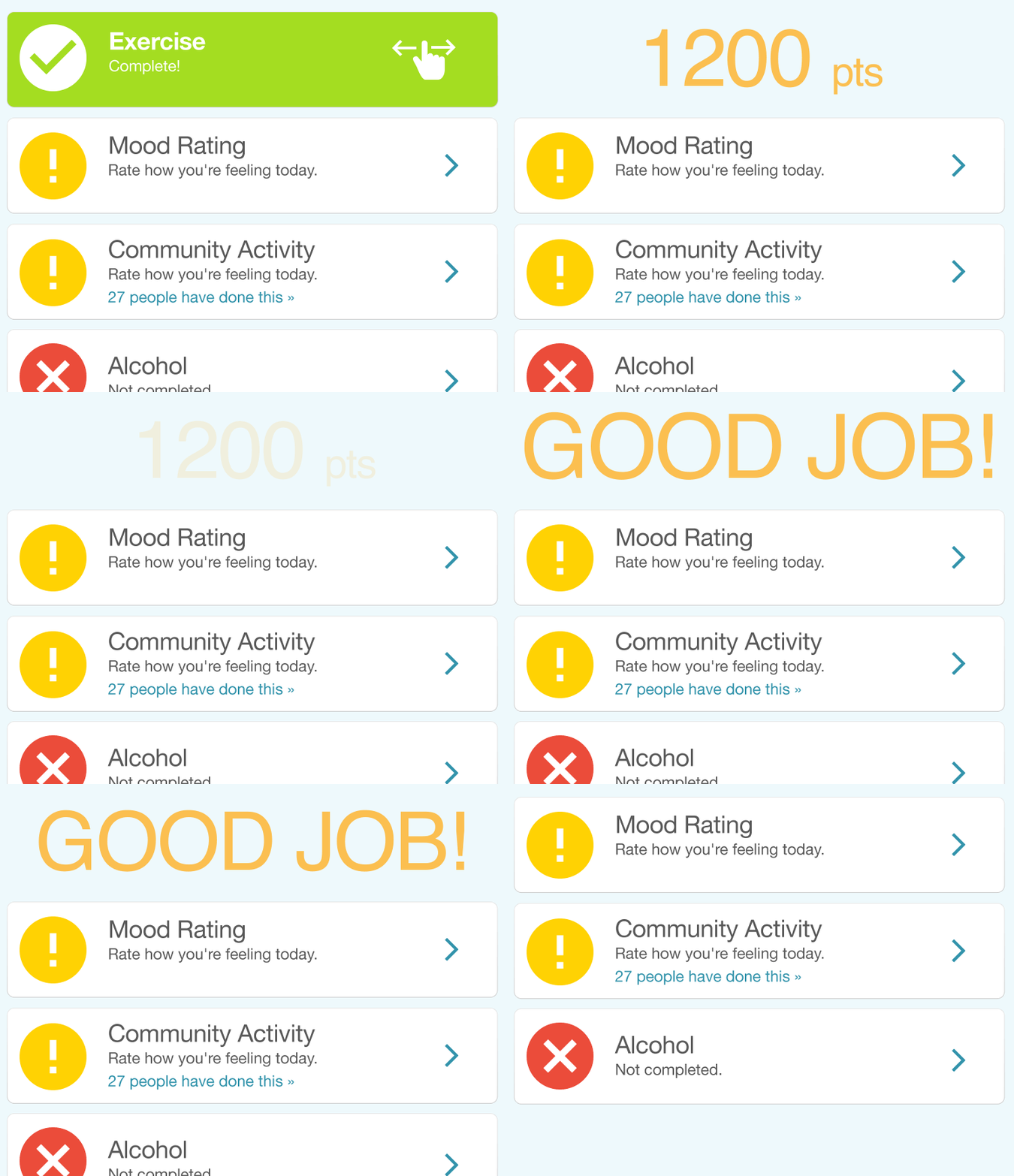
“Marco? Polo!” Provide immediate feedback when a user has successfully completed an action. It feels great to hear back a “good morning” when completing a task. This is like water: “Good job! Right on! Woohoo!”
19. Final Comps
Create pixel-perfect comps, including components, states, proper font styles, and showcasing the most relevant flows in the experience. In a project with a variety of screen sizes, always design for the smallest first. Mobile-first.
20. Use of Images and Icons
The usage of these will vary depending on the target audience and the subculture; use icons that have strong meanings in these groups. Beware of using SVG files so that everything looks sharp on high-density screens.
21. Fonts & Colours Hierarchy
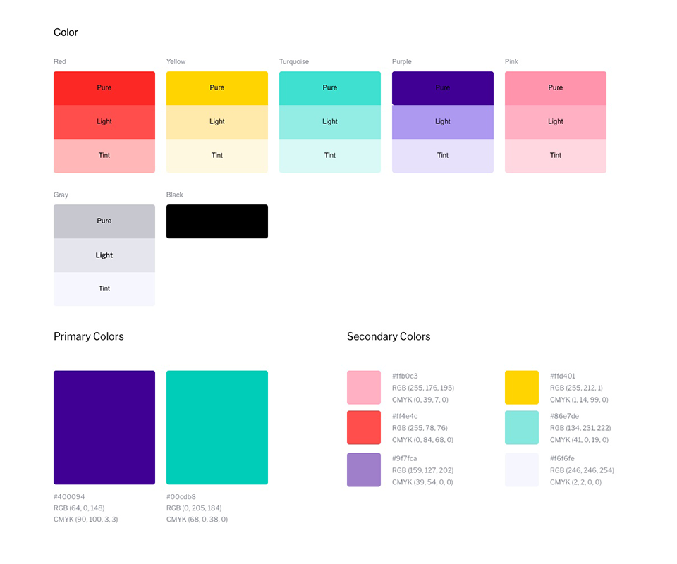
Use color to provide a focal point for the action to be taken on the screen. “What do I need to tap here? Please, don’t make me think.” Similarly, establish a hierarchy in your character styles and apply them with consistency throughout the experience.
22. Micro Copy
Every word is important, and a bit of personality can help your brand. “Good job! Woohoo! Excellent!” A high five and even sounds can have an emotional feeling associated with the moment in the experience.
23. Micro Interactions
Micro-moments of delight, like the refresh animation, the spinner, the pop-up, the slider. Every interaction is a potential place to add a connection with the user by providing feedback. Surprise!
24. Transitions
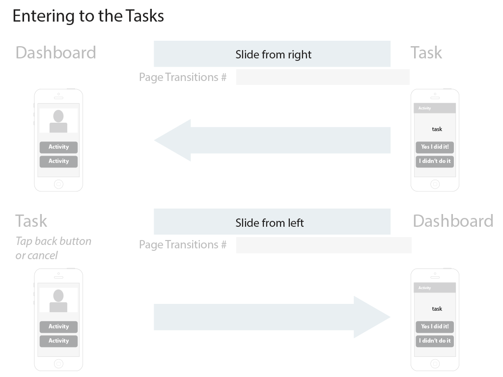
Like in the movies, use transitions and animations to provide a sense of life, location, evolution, progression. Sliding left and right are like the doors connecting and transporting users through the rooms in this building.
25. KPI Setup
What does the finish line look like if we’ve won the race? What did we want to achieve? So, from the plan we had, what are your key performance indicators? Keep an eye on them during the life of the projects; these will allow you to understand how things are working and will drive you to take actions to achieve these goals.
AB Test Plan
In design, try to have more than one option. Think outside the box, experiment with layouts, colors, components, and interactions. Always have a backup plan, from providers to technologies, etc.
Ongoing Test
Keep an eye on your metrics, challenge your design decisions by running surveys or personal consultations. Make new prototypes, conduct tests with people you don’t know to get honest answers. The best advice always comes from proper research and firsthand contact with the target audience.


